Issue #84, Volume #3


Plus, Why “Safe” Bonds Will Continue To Collapse
Inside today's Daily Journal…
|
As you may know, I’ve recently written a new book, 2029: The End of America: Why The Age Of Paper Money Is Ending And How To Survive The Coming Monetary Reset.
I’m proud to tell you that it is now the #1 selling book on Amazon (in Wealth Management). We’re launching a special $4.99 Kindle offer on the book this week.
Why are we virtually giving the book away?
Because it is more important than ever that every American knows three things about what is about to happen.
1. The government is bankrupt and is going to engineer a massive, global monetary reset to escape its debt. The biggest victims of this will be Americans who are owed $100 trillion in Social Security benefits. By roughly 2029, the collapse of the Social Security system will become an inescapable reality. And, trust me, you will not get paid anything like what you are owed.
2. The age of paper money is ending because, all across the major Western democracies, paper money has allowed governments to accrue politically and culturally destabilizing debts, to finance endless foreign wars, and most critically to rob wage earners through the invisible tax of inflation. In the next crash, the demand of every free people will be, first and foremost, sound money.
3. To build a resilient portfolio, you cannot rely on bonds, as fixed income securities will be virtually destroyed in the coming monetary reset, just as they were in the 1970s.
So how can you build a truly resilient portfolio – something that you can absolutely depend on, come hell or high water? I spent a year researching that question. And I found the answer in a mathematical theorem that was discovered in 1773.
But before I explain the math, let me back up to explain what I believe is, by far, the most important concept in portfolio construction: pairwise correlation.
In 1990, Harry M. Markowitz won the Nobel Prize in Economic Sciences. He won because of a 15-page paper, “Security Selection,” that was published in 1952 in The Journal of Finance (volume 7, issue 1). Markowitz’s idea is that what matters in investing is not only each investment by itself, but how your investments behave together.
Think of your portfolio as a grocery bag. You might want to buy some things that come in glass bottles, because many people prefer bottles to cans. But if everything in your grocery bag is made of glass, one stumble on the way to the car and everything in the bag shatters. As you know, the market “stumbles” frequently. So, you need a “grocery bag” that isn’t made up 100% of glass.
Seems obvious, sure. But how do you define, mathematically, how diversified your portfolio actually is?
Answering that question is what won Markowitz the Nobel Prize. His research on pairwise correlation proved that if you mix several investments that are not correlated to each other (“pairwise”), you can get higher returns with less volatility. Pairwise correlation just means looking at each asset in your portfolio and measuring its correlation against all of the other assets. That gives you an average of all of the pairwise correlations. It is that average that defines, objectively, how much diversification benefit you actually get.
This kind of portfolio diversification is the only "free" return in investing. You can own high-performance stocks, in a low-volatility portfolio – if your positions are not correlated. That gets you the most return, for the least amount of risk.
Most investors think diversification means owning more stocks. It doesn't. It means owning stocks that don't move together. That's a completely different idea — and almost nobody does it correctly.
Porter’s Permanent Portfolio achieves this by owning four equal buckets of assets (stocks, bonds, gold, and cash) that are not correlated. And, for decades, Wall Street has helped clients achieve this by creating 60% equity / 40% bond portfolios, as, since the 1980s, bonds have been negatively correlated to stocks.
The trouble is, as inflation becomes more and more permanent and structural (as the only way the government can finance its debt) the pairwise relationship between stocks and bonds has become highly correlated. And, of course, bonds are in their worst bear market ever.
So, the question I wanted to answer was:
For people who do not yet have enough assets to accept the lower (but safer) returns of a Permanent Portfolio, for people who genuinely need market-beating annual returns, is there a way to build a 100% equity portfolio that would have the same low-risk dynamics of a Permanent Portfolio?
In short: Is there a way to build a truly resilient portfolio that is 100% stocks?
And the answer is yes, but only if the pairwise correlations are extremely low.
What I had to determine was: how many positions can you have in a portfolio without having any overlapping risk exposures? How many positions can you have before, inevitably, the pairwise correlation average increases?
The answer was discovered in the 1773 mathematical theorem I mentioned above. The kissing number problem in geometry proves that exactly seven circles of equal radius can simultaneously touch – but not overlap. I mapped this directly to portfolio construction: a monetary hedge at the center, surrounded by six equity sectors, chosen specifically because their fundamental drivers don't move together.
What sectors are non-correlated and offer investors excellent economics with “power law” winning businesses?
The answer is:
-
insurance
-
food and tobacco
-
pharmaceuticals
-
defense
-
royalties
-
technology infrastructure
Seven total positions. That's it.
We can further reduce portfolio risk by adding two positions within each risk circle, if they do not have a pairwise correlation above 0.55.
Most people think that simply adding more stocks will reduce volatility. But it doesn’t. If your average pairwise correlation is low enough, adding an eighth or ninth position doesn’t reduce your portfolio's risk at all – in fact, it increases it. Past seven truly non-correlated positions, you're just diluting your best ideas, a truth that was first discovered in geometry.
How do you select individual stocks within this non-correlated framework? You look for three, well-proven "edges."
1. The quality anomaly. Companies that earn a return on invested capital (“ROIC”) above 15% — consistently, year after year — dramatically outperform the market. This is one of the most thoroughly documented facts in academic finance, confirmed across 60 years of data in 24 countries. The anomaly persists because benchmark-hugging institutional managers are structurally penalized for holding boring compounders through periods when they lag the index. Their career risk is your alpha.
2. The Lindy premium. Under the Lindy distribution, the longer a company has survived, the longer it is likely to continue surviving. A business that has operated for 100 years has crossed at least one secular bear market, one technology disruption, one management generation, and one major economic crisis. The market prices old companies as if they're ex-growth. They're not. They're fortresses.
3. Non-correlation. Sector ETFs (exchange-traded funds) have an average pairwise correlation around 0.48. The right individual stocks in those same sectors have an average pairwise correlation around 0.27. That 21-point gap — at the same expected return — is roughly a 28% reduction in portfolio variance. It's not subtle. This is the single most underappreciated edge in portfolio construction.
I call this approach “The Honeycomb.” Why? Because you see the same kissing number geometry in nature, in a honeycomb.
My full Honeycomb portfolio produced…
-
a 21.37% compound annual growth rate (“CAGR”) over 13.3 years (April 2013 through April 2026), compared to the S&P 500's 12.83% – that's roughly 850 basis points of annual outperformance
-
Sharpe ratio: 1.04 versus 0.56 for the S&P 500 index
-
maximum drawdown: -30.24% versus -33.92%
-
a $10,000 investment became $131,536 – the same $10,000 in the S&P 500 became $49,842
-
the portfolio beat the index in 12 of 14 calendar years (86%)
The best stress-test year was 2022. While the S&P 500 fell 18.2% in the sharpest rate-tightening cycle in four decades, this portfolio returned +21.2% — a spread of nearly 40 percentage points. No market timing. No tactical trading. The structural architecture was simply positioned for exactly the inflationary, rising-rate environment that crushed growth stocks.
The most powerful evidence is an out-of-sample test. Using only the Lindy anchor stocks and extending the record back to March 1993 — 33 years —
-
the basket produced a 21.02% CAGR versus the S&P 500's 10.64%
-
it beat the index in 29 of 34 calendar periods (85%)
-
a $10,000 investment became $5,509,423 – the same money in the S&P 500 became $283,797. That's a 19x difference in terminal wealth.
There's no survival bias here: the selection rule for the anchor stocks uses only historical information. The "oldest continuously operating company in each sector" doesn't change. Any analyst applying this rule in 1995, 2005, or 2015 would have arrived at the same names.
The equity selection has four parameters: the ROIC quality gate, the Lindy age threshold, the correlation ceiling, and the momentum lookback. The Sharpe ratio doesn't materially change across 20% to 40% perturbations to any of them. You can't tune your way into this result — it emerges from the structure.
The full paper, which I've submitted to The Journal of Finance, with all the back-tested data, parameter sensitivity analysis, and academic citations — runs to 9,000 words.
But I have written a layman’s explanation of how to build a Honeycomb portfolio in my book, 2029 The End of America: Why The Age of Paper Money Is Ending And How To Survive The Coming Monetary Reset.
And yes, it’s for sale this week. For only $4.99.
Horse, meet water.
P.S. All Partner Pass members will get a copy of my full Journal of Finance article this week and a complete “how to guide” memo on Honeycomb portfolio construction. Look for it in your inbox.
Tell me what you think of today’s Journal… good, bad, or anything in between: porterstansberrydirect@gmail.com
Good investing,
Porter Stansberry
Stevenson, Maryland

3 Things To Know Before We Go…
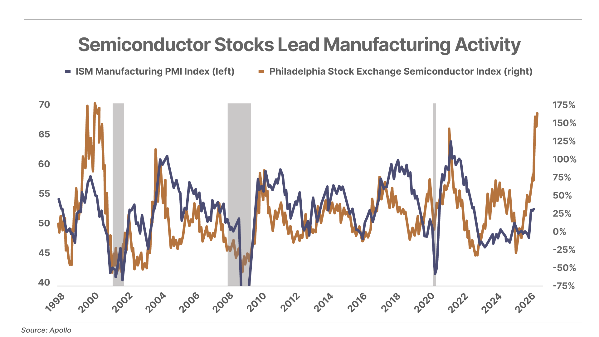
1. Soaring semi stocks may be forecasting a U.S. manufacturing boom. Semiconductor chips go into nearly everything built today, and with lead times of six to 12 months, manufacturers order them before ramping up production. This has historically made rising semiconductor demand – which we are seeing right now – a strong leading indicator of broader manufacturing activity.
2. ETFs outnumber U.S.-listed stocks for the first time. The number of exchange-traded funds ("ETF") has officially surpassed the number of publicly listed companies – a staggering milestone that highlights a multi-decade decline in public stocks alongside an explosion of passive investment vehicles. There are roughly 4,300 U.S.-listed ETFs versus around 4,200 stocks – a decline from 8,000 in 1996.
3. Loan delinquencies on the rise. The number of loans in “serious delinquency” – those more than 90 days late – is reaching alarming levels. This includes more than 13% of credit card loans and 5.6% of all auto loans, the highest levels for both categories since 2011. Meanwhile, student-loan delinquencies have shot up to 10.3% from almost zero during the past several years of moratoriums. The average consumer is facing significant financial pressure.
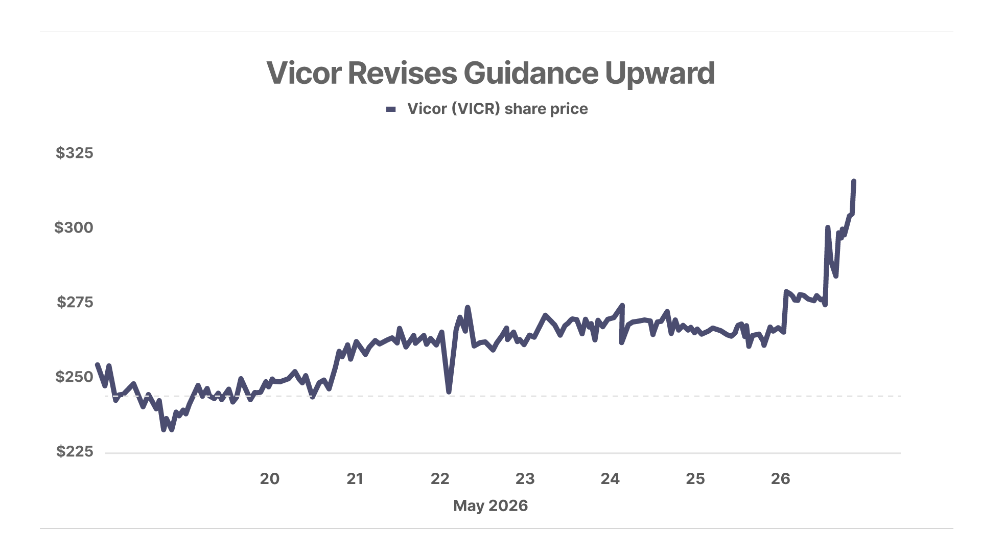
Chart Of The Day… Vicor (VICR)
Shares of power systems company Vicor (VICR) – a recent Complete Investor recommendation – shot up 21% today and 31% for the last week after it revised Q2 revenue guidance upward, citing increased product revenue and additional royalties from a new licensee.
Mailbag
“Fascinating”
Jim S. writes:
I have been telling intelligent friends for five to six years that the U.S. debt was the biggest issue facing our country. Fell on deaf years.
Paying a trillion for interest takes away the ability to fund social programs (non-Medicare and Social Security) that keep the lid on dramatic social unrest. The current teenage “takeovers” of malls, streets, and stores will seem like child’s play if the federal government stops funding programs to keep the poverty level in check.
Worrisome times. You are a beacon of logical thinking when we need it most. I just ordered your book, 2029: The End of America.
“Violent Lives Of Black Americans”
Johnny H writes:
Dear Porter,
I have been a reader and subscriber of your work since your time at Stansberry Research in the early 2000s.
Regarding your recent piece, as an African-American, I find the content difficult to read. However, I recognize that if the information is factual, denying it is unproductive. To provide a more comprehensive perspective, I suggest including statistics on African-American crime categorized by the following:
Non-urban and rural areas
Income levels
Two-parent households
Decade-by-decade comparisons from the 1940s to the present
I intend to look into these metrics myself, but I believe they would be a valuable addition to your commentary.
The reason I take issue with the current piece is that it risks perpetuating the underlying assumption that Black people are inherently violent. By not explaining the broader context or "why" behind the numbers, it reinforces unproductive stereotypes.
I grew up in a rural community in a large family. Despite having siblings (total 13) who grew up in both rural and urban environments, none of us are violent and based on your stats some of us should be. I suspect there are clear reasons for these different outcomes, and I would appreciate some focus on non-violent Black communities and their corresponding statistics.
Porter Comment: Johnny -
I truly appreciate your letter (and your long support of me and my businesses).
What any honest, comprehensive look at the data shows is that there are many factors that lead to violent and anti-social behavior. And, unfortunately, one factor that is readily apparent is that black people, in aggregate, are very dangerous. This is overwhelmingly true – it isn’t a trope, it isn’t racist, and there are not any obvious or ready explanations for it – at least none that I have yet seen explained with good data.
I would argue that it is only racism (the DEI kind) that prevents these obvious facts from being recognized more readily and studied more honestly.
One thing, for example, that I find extremely interesting is the huge dispersion across different black populations.
Example: I’ve spent a lot of time in the Bahamas. It is an incredibly dangerous and violent place. The homicide rate is 31 out of 100,000. That’s among the most dangerous places in the world. Many other places in the Caribbean with similar levels of development and infrastructure are similarly extremely violent – Saint Lucia (39), Saint Kitts (64), Trinidad (45) – but others are vastly less dangerous, like Barbados (7.4).
Here’s another outlier – Rwanda is one of the safest places in the world. It has a homicide rate of 3.6 per 100,000. In part that’s because of its authoritarian government, but there may be other factors at work too. Ghana is very, very safe (1.8).
I certainly do not believe that all black people are inherently violent. But I also know, for certain, that black people in America – in aggregate – are incredibly violent. In America, black women (3.2 per 100,000) commit murder almost as often as white men (4.5). In some years, like in 2020, more black women (per capita) commit murder than white men. That’s a shocking statistic. It’s hard to believe.
In the interest of public safety, it means we should invest heavily in policing black communities.
It also means we should work harder to understand the root cause of these problems and try to address them proactively in our communities.
I will say one other thing, that you may be offended by, but that I believe should be part of this conversion. If you were to judge me or my family by the example set by a meth-head, white trash family in West Virginia, I would be offended. I don’t do drugs, neither do any of my friends or my children. I take care of my family, etc. That behavior – the meth heads in West Virginia – isn’t embraced or accepted in my community. Those people are mocked and scorned, openly.
In Baltimore, the mayhem that’s caused by the black community – the dirt bike riding, the petty crime, the squeegee boys (who run a racket on the public in the streets), the public drug and alcohol abuse, and even the serious and violent drug culture – is widely embraced and even celebrated by the black community. The art – music, graffiti, fashion, etc. – celebrates the violent drug culture. People deeply involved in violence and crime are not shunned or shamed. Instead, in Baltimore, and in many urban areas the black community protects and even idolizes people who are deeply involved in crime.
How do you solve that, I wonder…?
In Friday’s Daily Journal, Porter wrote about Arthur Burns’ 1979 central bank speech, where he warned of a monetary reset. Readers shared their thoughts…
“Arthur Burns”
Peter G writes:
Hi Porter,
Your essay today was outstanding. My question has to do with gold and Bitcoin. Do you believe that both assets are consolidating (even tilting downward) because interest rates are rising, even though some QE (quantitative easing) is taking place? Or is the market just fixated on AI stocks as the flavor of the moment and therefore neglecting any forward thinking in terms of the theme of your essay today?
P.S. I sent today’s essay to my kids!
Porter Comment: Bitcoin is tightly correlated to liquidity in the banking system, which tightened throughout 2025 and has been increasing steadily in 2026, thanks to a resumption of the Federal Reserve’s asset purchases (aka, printing money). Gold is correlated to credit creation, with a lag. Credit growth continues to accelerate, but gold may have overshot the model this year.
Porter & Co. Market Snapshot
| Price | Friday's Return | Year-to-Date Return | |
|---|---|---|---|
| S&P 500 Index | $7,473.47 | 0.37% | 9.17% |
| Gold per ounce | $4,521.00 | -0.56% | 3.93% |
| Bitcoin | $77,279.93 | -1.81% | -13.29% |
| Oil (West Texas Intermediate) per barrel | $96.60 | -2.76% | 63.58% |
| Berkshire Hathaway (BRK) | $728,641.00 | 1.43% | -3.47% |
| Porter's Permanent Portfolio | - | -0.08% | 0.14% |
| The Better Than Berkshire Index | - | 1.09% | 3.56% |
| Yield | Friday's Change | Change Year-to-Date |
|
| U.S Treasury 30-Year Yield | 5.07% | -5 bps | 22 bps |
*A Complete Investor risk rating of 1 is defined as a "low risk, high allocation" security, while positions rated closer to a 5 are higher risk. Porter & Co.'s top-ranked positions include those rated either 1 or 2 in Complete Investor portfolio.
Porter & Co. Top Positions
| Publication | Ticker | Description | Total Return |
|---|---|---|---|
| Complete Investor | BWXT | BWX Technologies | 255% |
| Tech Frontiers | QURE | uniQure | 237% |
| Complete Investor | BTC/USD | Bitcoin | 186% |
| Complete Investor | PM | Philip Morris | 133% |
| Tech Frontiers | ROIV | Roivant Sciences | 133% |
| Tech Frontiers | SGMT | Sagimet Biosciences | 131% |
| Tech Frontiers | QURE | uniQure | 131% |
| Complete Investor | ARM | ARM Holdings | 122% |
| Tech Frontiers | TGTX | TG Therapeutics | 112% |
| Distressed Investing | PTON | Peloton Interactive | 104% |
Prices as of 4:00 pm ET May 22, 2026
Please note: The investments in our “Porter & Co. Top Positions” should not be considered current recommendations. These positions are the best performers across our publications – and the securities listed may (or may not) be above the current buy-up-to price. To learn more, visit the current recommendations page of the relevant service, here. To gain access or to learn more about our current recommendations, call our Customer Care team at 888-610-8895 or internationally at +1 443-815-4447.